General questions about Indigo, the scene format, rendering etc...
-
2kemon
- Posts: 51
- Joined: Sun Feb 25, 2007 10:59 pm
Post
by 2kemon » Mon Mar 26, 2007 7:27 am
...yeah, I guess I can se the irony in that

I'm quite sure you're happe I haven't been rambling on about all my rendering questions, since I'm a total noob.
No question though, Indigo is the way to go if you want true photo realistic images, with acceptable setup times!
-
Kram1032
- Posts: 6649
- Joined: Tue Jan 23, 2007 3:55 am
- Location: Austria near Vienna
Post
by Kram1032 » Mon Mar 26, 2007 7:32 am
Noobs are welcome

Everyone here once was a noob! Including Ono

-
RMS
- Posts: 2
- Joined: Sat Dec 30, 2006 12:16 pm
Post
by RMS » Mon Mar 26, 2007 8:06 am
this is my version of the new Logo, hope you like it.

-
Kram1032
- Posts: 6649
- Joined: Tue Jan 23, 2007 3:55 am
- Location: Austria near Vienna
Post
by Kram1032 » Mon Mar 26, 2007 8:12 am
*lol*
one just does a logo, the other one does both a mat prev scene AND a logo...
Nice, too

-
arneoog

- Posts: 504
- Joined: Sun Jun 25, 2006 2:19 am
-
Contact:
Post
by arneoog » Sun Apr 01, 2007 10:50 am
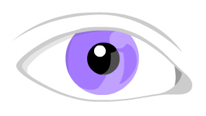
Here is a little idea I had

An eye, with an I reflection


What do you think?
-
Attachments
-

- The eye..
- newlogo001.jpg (12.74 KiB) Viewed 3779 times
-
DaveC
- Posts: 596
- Joined: Mon Sep 11, 2006 12:20 am
- Location: The Tottenham, London, UK
-
Contact:
Post
by DaveC » Sun Apr 01, 2007 11:04 am
It's a bit too subtle. What images can you come up with based on that one, but with the eye viewed from the side... (just trying to inspire you). I still like your original design

-
arneoog

- Posts: 504
- Joined: Sun Jun 25, 2006 2:19 am
-
Contact:
Post
by arneoog » Sun Apr 01, 2007 11:07 am
yes, but it's only an idea, not a final logo candidate

Just to lazy right now to make anyting complex/nice

Hehe..
-
rgn
- Posts: 12
- Joined: Sun Sep 24, 2006 9:57 am
Post
by rgn » Mon Apr 09, 2007 11:42 am
While I'm not opposed to a new logo, I've not seen anything yet that looks like a real improvement on the old one, though I do like Matsta's reworking of the old wordmark (with the wave).
I'm aware of the shortcomings of the current logo with regard to reproducibility, but I think it's conceptually stronger than most of the alternatives put forth thus far. There's even an old vector (svg) version of it kicking around somewhere that would probably look reasonable with a bit of tweaking.
-
DaveC
- Posts: 596
- Joined: Mon Sep 11, 2006 12:20 am
- Location: The Tottenham, London, UK
-
Contact:
Post
by DaveC » Mon Apr 09, 2007 12:12 pm
My idea for a new logo...
The colour, obviously, is debateable. The effects, dismissable. But, the overall design? Well, you tell me...
-
Attachments
-

- New logo idea
- newindigo.jpg (71.72 KiB) Viewed 3958 times
-
rgn
- Posts: 12
- Joined: Sun Sep 24, 2006 9:57 am
Post
by rgn » Mon Apr 09, 2007 12:39 pm
Not to be harsh, but I'd stick to solid colors - the Photoshop layer effects really have no place in a professional logo, for practical as well as aesthetic reasons (unless you're Google, but nevermind them).

As for the design, did you have something particular in mind that you were trying to convey? It looks vaguely like the Apple logo at first glance, and moreso with that choice of color, but what was the thought process behind it?
-
Kram1032
- Posts: 6649
- Joined: Tue Jan 23, 2007 3:55 am
- Location: Austria near Vienna
Post
by Kram1032 » Mon Apr 09, 2007 9:26 pm
I guess, indigo should have an indigo - colour in it

Maybe, if you could modell such a button, the effects would appear to be not "just" effects

The overall shape looks great, but rgn is right: a bit like apple, though.
( I guess, the colour makes this effect even stronger...)
-
suvakas

- Posts: 2613
- Joined: Mon Sep 04, 2006 11:08 pm
- Location: Estonia
-
Contact:
Post
by suvakas » Mon Apr 09, 2007 9:41 pm
Sorry Dave (and no offence), but this is not a logo. I remember doing stuff like that when i first saw Photoshop. Also it's far from looking pro. I recommend you to start in vector right in the beginning (or if not, then at least think about how you would put it into vector format and if it would look good).
I think the first 2 questions when doing logo should be: A) is it stylish enough? B) does it look professional?
-
DaveC
- Posts: 596
- Joined: Mon Sep 11, 2006 12:20 am
- Location: The Tottenham, London, UK
-
Contact:
Post
by DaveC » Tue Apr 10, 2007 12:59 pm
OK. I'm bracing myself for more slating. ANOTHER attempt at a new logo...
And, yes, I do still love the old one...
I'm not a professional designer, but maybe these attempts can be used as inspiration.
-
Attachments
-

- newindigo_b.jpg (4.17 KiB) Viewed 3852 times
-
F.ip2
- Posts: 160
- Joined: Thu Aug 10, 2006 11:05 am
Post
by F.ip2 » Tue Apr 10, 2007 1:54 pm
it also looks close to apples logo - shape of an apple.
davec, designing is fun - learning it a hard rocky way.
the new logo is already quite more different. put the words
renderer and "ndigo" some where.
render engine or so could be on the left of the "I".
keep on going!
--
C l a a s E i c k e K u h n e n
Artist : Designer : Educator
Assistant Professor Industrial Design
Kendall College of Art and Design
of Ferris State University
-
suvakas

- Posts: 2613
- Joined: Mon Sep 04, 2006 11:08 pm
- Location: Estonia
-
Contact:
Post
by suvakas » Tue Apr 10, 2007 6:45 pm
Last one is much better !!
You're getting there Dave. Keep going

I also agree with F.ip2, that it could include some hints to renderer (or something like that).
Who is online
Users browsing this forum: No registered users and 10 guests
